 |
| 1. |
 |
| 2. |
 |
| 3. |
 |
| 4. |
 |
| 5. |
 |
| 6. |
 |
| 7. |
 |
| 8. |
 |
| 9. |
 |
| 10. |
1. Eugene Richards
2. Eugene Richards
3. Bill Viola
4. Bill Viola
5. Bill Viola Google Images
6. Bill Viola
7. Chrystel Lebas
8. Chrystel Lebas
9. Chrystel Lebas
10. Damien Hirst
|
| 1. |
|
| 2. |
|
| 3. |
|
| 4. |
|
| 5. |
|
| 6. |
|
| 7. |
|
| 8. |
|
| 9. |
|
| 10. |
For my Light Painting images, we set the shutter speed on the camera to slow. We then shone different torches and laser pens onto the subject. After this effect worked, we thought it would be interesting to add physical movement to our photos. We started to walk and slide to the other side of the room. The camera was able to show our journey, with our movements being shown behind us. Photoshop Experiments  |
| This photo is of a tree in black and white, layered over the top of my view of the sky from a plane. This looks good as it looks like there is a sunset behind the tree. I did this by opening both images in Photoshop in separate windows then dragging one on top of the other. |
 |
| This was originally in colour, but I decided to desaturate (make black and white) to create a more ghostly feel. I also darkened the background and lightened the main image. |
 |
| I added white lines to the sun beams to make them stand out more and make a brighter tone. I achieved this by using the brush tool with a large brush and drew the lines on 'Screen' mode. After doing this, I added a photo of me looking like a ghostly spirit, by dragging in, which completely changes the whole tone of the picture, and makes it more scary. |
 |
| I layered a tree on top of the image of the sky, which contrasts because the tree is dark and spiky, whereas the sky is light and wispy. I don't think this photo is the most effective because of the different contrasts, and it doesn't really resemble a real scene, which I think the others do. To achieve this, I simply dragged the tree over the top of the sky, then changed the settings from 'Screen' to 'Overlay'. |
 |
| The original photo of just the added white lines to the sunbeams. With these lines, I think the sun itself looks brighter and the beams appear longer. I think this photo could have been better if it was in colour, because it makes the photo seem more upbeat, whereas in black and white, it looks solumn and sad. I created this by drawing white lines with the brush tool on 'Screen' mode. |
 |
| I like this image of a tree layered over a picture of the mountains in South Africa. I changed the colours to make them appear darker to resemble a sunset. The tree branches could look like lightening, which means the photo could have two different moods; a dark storm or a pretty sunset. The clouds could also be used to interpret either of these scenes. This picture was made by dragging the tree on top of the mountain scene from separate windows and making it really dark on 'Vivid light' mode. |
 |
| I really like this image of a scene in Cape Town. The foreground includes a Wheel, palm trees and cars. The background is a photo of the mountains, which makes it seem that they are lingering behind. The photo of the scene was taken in black and white, and the mountains in colour. I think this adds effect because the palm trees are dark and you can only see there outline, and the wheel is illuminated by the sun in the mountains photo. I made this picture by simply dragging the wheel photo on top of the mountain image. Before doing this, I darkened the palm trees and the cars using 'Desaturate', then lightened it from complete black and white. I then changed the settings from 'Screen' to 'Overlay'. |
 |
| Original image. |
 |
| I think all these different edits show different moods and tones. This one is quite abstract and looks sketchy. |
 |
| This edit looks quite similar to the original, but is slightly darker. The commuters look gloomy and dark, the stereotypical view of commuting in London. Everyone looks to be in a hurry and with their heads down. |
 |
| This image looks similar to the one above, but with the illusion that its raining. |


 |
| This is to show that the camera will capture every movement you make when its shutter speed setting is slow. |

 |
| This image is effective in showing the objective. Movement and light are both captured well. |


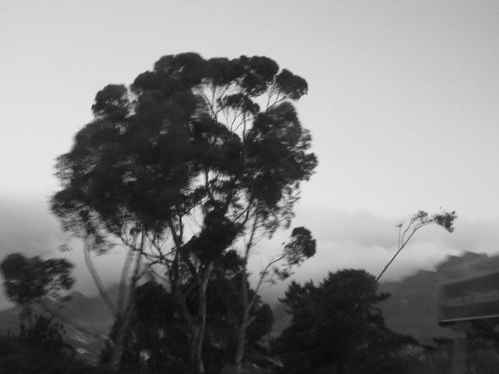 |
| Because of the black + white effect, this image looks like a dark and stormy day in Britain, but was really a light Summers breeze. |
 |
| The view of the Harbour at Dusk |
 |
| View from the aeroplane, very early morning sunrise over Africa. |
 |
| This was taken at U2's 360degree Concert Tour in Cape Town. The lighting was incredible and ever-changing. |
 |
| Taken at a community football club in a shanty town, encouraging young people to take part in sports. |
 |
| My mum soaking up the sun and relishing the view on top of Table Mountain. |
 |
| At Robben Island. I love the complete opposites of the messages on the signs. |
 |
| Cape Town's answer to the London Eye. This photo reminds me of Santa Monica beach. |
 |
| This contact sheet is helpful in finding out which negative would be a good photo to develop. You can see the images in a larger format which makes it easier to pick the best ones. |


 |
| I made this image by layering two negatives over the top of each other. The images are quite similar but the positioning of some of the subjects - such as the champagne bottle, is different. I think it works well because of the dark contrasting colours. |


